Making a complex tool feel immediate.
Scope — Strategy, systems, interface
A product design engagement focused on reducing friction across planning, decision-making, and delivery without flattening the work behind it.
A product design engagement focused on reducing friction across planning, decision-making, and delivery without flattening the work behind it.
We mapped the moments where information became effort, then rebuilt the system around the decisions people needed to make next.
The result is a calmer product language: fewer dead ends, clearer hierarchy, and a system that can grow with the people using it.
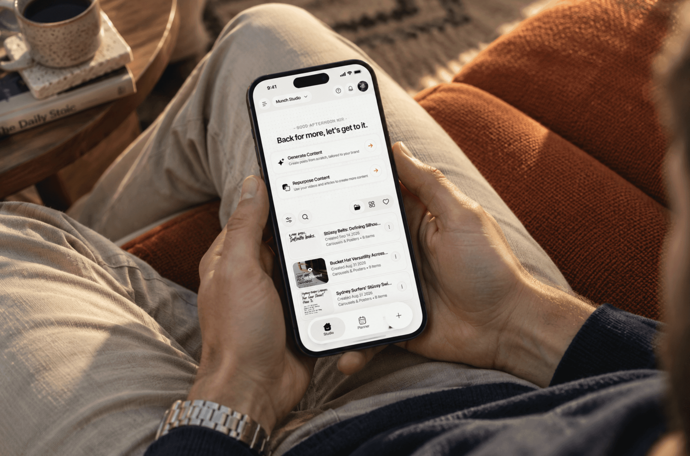
Studio is where the actual content gets made, and I split it into two paths instead of one blank canvas. Generate Content starts from nothing, brand voice and visual identity baked in so nothing needs manual tuning. Repurpose Content pulls from what a business already has (videos, articles, old posts) and turns it into new formats, since most small businesses have more raw material than they realize.
Everything that comes out lands in a single library, filterable by type and search, so a growing archive of carousels, posters, and reels stays usable instead of turning into a dumping ground. The goal was to make content feel abundant without making it feel disorganized: generate freely, then find anything in seconds.
Munch taught me that AI products live or die on trust, not capability. Early on, the instinct was to make the AI do more: generate faster, suggest harder, automate everything it could reach. What actually moved the needle was the opposite. Every time I gave users a visible reason for an AI decision, or an easy way to override it, engagement went up. The lesson stuck: people don't resist AI because it's wrong, they resist it because they can't see why it did what it did.
That's still the problem I'm designing around. Munch has grown from a single-brand tool into something agencies run for a dozen clients at once, and every new surface (Studio, the Social Inbox, Repurpose) has to answer the same question a first-time user asks and a power user asks differently: what is the system doing right now, and can I change it? Scaling the product hasn't meant adding more screens so much as finding where the existing ones were quietly asking too much of people, and rebuilding those moments so they ask less.
The part I'm still working through is where automation should stop being optional. Right now almost everything routes through a review step (approve a post, edit a caption, confirm a clip) because that's what earned trust early on. But for teams running content at real volume, that same review step is starting to feel like friction rather than safety. Figuring out which decisions actually need a human, and which ones the system has now proven it can make well, is the next real design problem here, not a UI problem so much as a question of when confidence has to be re-earned.