A brand built to outlast the charity.
Scope — Identity, Color System, Typography
I designed the full identity for 18 Holes Foundation: logo, color system, and tone of voice, built from day one to support a future clothing line sold to golfers everywhere, not just the foundation's own community.
I designed the full identity for 18 Holes Foundation: logo, color system, and tone of voice, built from day one to support a future clothing line sold to golfers everywhere, not just the foundation's own community.
I aimed the brand at golf first and cause second: a mark and palette that read as an established golf label, so the clothing line could hold its own on any rack, not just in a donation bin.
One identity that works on a foundation's polo and a retailer's shelf, built for every golfer, with the mission built into it rather than printed on top of it.
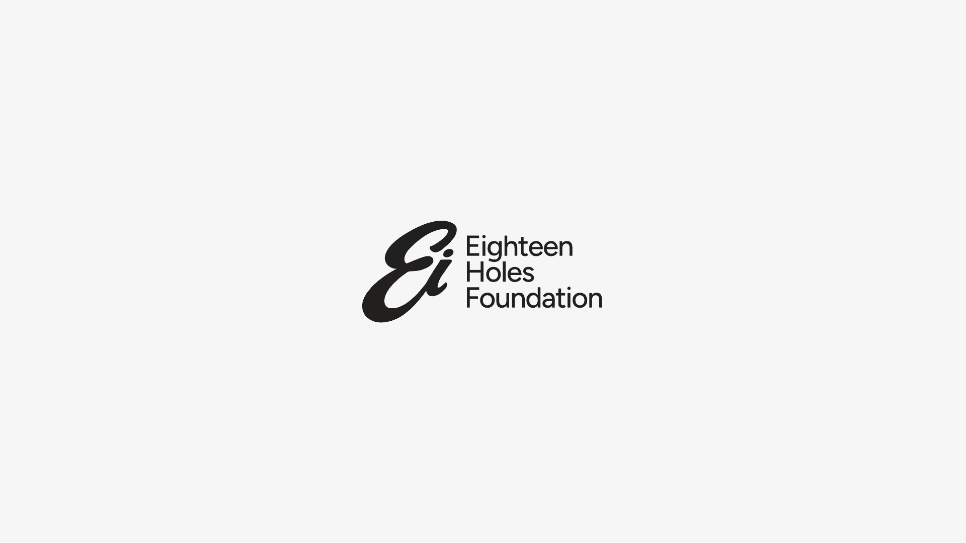
The "Ei" mark started from the idea of a single golf swing: one continuous line that curves back on itself, the way a club moves through impact and follow-through. I wanted the mark to carry the sport before it carries the name, so someone could recognize it as golf on a hat or a sleeve without ever reading the letters.
The rest came from constraint. A foundation identity that will also live on a clothing line has to survive embroidery, small print, and a single Pantone. I stripped the mark down until it held up at 20mm, then built the wordmark (Eighteen Holes Foundation) as a quiet, structured counterpart, so the logo could do the personality and the type could just be legible.
Fairway green is the anchor. It's the color of the actual grounds these players are being brought back to, and it lets the brand sit next to real golf apparel without looking like merch for a cause. I paired it with a near-black, dusk green rather than pure black, so the palette stays warm even in its darkest values, never sterile or corporate.
The off-white rounds it out as breathing room: apparel, packaging, and any print material needed a neutral that wouldn't compete with the green or read as clinical white. Together the three colors had to do double duty, serious enough for what the foundation stands for, and clean enough to sell on a shelf next to any other golf label.
The clothing line had to work two ways: as identity on a foundation member and as a product a stranger buys because it's a good cap. The script "Eighteen" keeps the sport-brand feel wherever the full mark would be too formal, on caps, towels, anything soft-goods.
Every piece it goes on is a small, ongoing fundraiser that doesn't look like one. No mention of the cause on the garment itself, just a brand strong enough to be worn for its own sake, with the mission built into the business behind it rather than printed on the chest.